Graphical Analysis in Forex Trading: Principles, Patterns, and Tips
Graphical analysis is a branch of technical analysis. The basic principles and mechanics of use are the same. What changes is the analysis tool, which is not the price (not in a strict sense) but the graph itself. Or, more precisely, the "patterns" that form on the graph.
Although graphical analysis is not "mandatory" like technical analysis and fundamental analysis, it is still a resource worth considering. At the very least, to refute or validate the evidence gathered through other analyses. Furthermore, it is more intuitive than technical analysis and - on paper - simpler than fundamental analysis.
In this article, we provide an overview of the topic, giving a precise definition, listing the basic principles and functioning, and describing the most important graphical patterns.
What is Graphical Analysis?
Graphical analysis is a practice that allows traders to derive signals and navigate the market by studying charts. So far, the definition is similar to that of technical analysis. Compared to the latter, however, the signals are not derived from statistical models relevant to the interaction between price and other elements (the so-called indicators) but from the simple "visual" evidence of the graph -
that is, from patterns or figures.
The chart, which must be strictly candlestick, draws figures. Some of these are
significant, meaning they repeat whenever the asset is about to behave in a certain way. Therefore, from the figures - or patterns - drawn by the graph, one can, under certain conditions, estimate the future movement of the price.
One point should be specified. Just like technical analysis - but also fundamental analysis - graphical analysis does not offer absolute certainties. It is simply a discipline, a practice that certainly has statistics on its side but is still based on the concept of "probability". Given a pattern, it is likely that the price will move in a certain way, but it is not absolutely certain.
For the rest, we are in the field outlined by technical analysis, at least from the point of view of principles. That is...
The market discounts everything. Graphical analysis, like technical analysis, is based on the evidence reported by the graph. It does not take into account what happens beyond the trades. From this point of view, the distance from fundamental analysis is marked. This principle, which is then a dogma, is a symptom of a weakness, that is, of the non-self-sufficiency of graphical analysis. Therefore, alone, it is not enough: it must be accompanied by the study of the economic environment as a function of price forecasting.
History repeats itself. Again, we are in the field of technical analysis, of which - it is worth repeating - graphical analysis is simply a branch. In essence, the market reacts in the same way to certain stimuli, so starting from an element, it is possible to derive valuable information. This is a principle, among other things, also shared by fundamental analysis. It is the necessary condition, to tell the truth, for any type of analysis. If the market were always unpredictable, and able to write a new story every day, it simply could not be studied.
Patterns in Graphical Analysis
We have said that graphical analysis makes use of patterns or figures and that, indeed, these represent the main analysis tool, the only source (within this discipline) to receive signals.
Now, graphical analysis is a discipline that is complex in its own way, not so much in terms of mechanisms but in terms of quantity.
The number of figures or patterns that are somehow significant and capable of offering signals to the trader is incredibly high. So numerous that they are classified into specific categories. The most important ones are three, divided by the type of signal they launch: continuation, reversal, and consolidation.
Continuation Patterns
The term "continuation pattern" refers to a figure in graphical analysis that is significant as it is capable of launching signals. Specifically, continuation signals, i.e.,
the continuation of the current trend. If the graph is about to form or has already formed a continuation pattern or figure, the trader receives a signal to continue, whatever it may be.
Continuation patterns are the most common and, in a sense, also the most difficult to track down. Their elements, in fact, are extraordinarily simple. They are excellent, therefore, both for those who want to practice trend following and for those who want to trade against the trend (in this case, the figures signal the impossibility of opening a position).
Reversal Patterns
The term "reversal pattern" refers to a figure that, although also significant and capable of launching signals like continuation patterns, suggests information, indeed estimates, of a completely opposite nature. Reversal patterns
signal that the market is about to reverse its course.
They are on average more difficult to study as they are visually more complicated. It is easy, in fact, to confuse a simple lateral movement with a hypothetical trend reversal.
Consolidation Patterns
The same discourse, but at the same time opposite, for consolidation patterns. These are significant figures that launch signals but of a "strange" nature. That is, neither reversal nor continuation. When the graph composes a consolidation figure, it means that the market
is destined to move sideways, at least for some time.
Consolidation patterns are the most difficult to study. Also because they are often confused with other types of signals. The risk of false signals is always lurking. Specifically, there is a tendency to take a reversal signal for a laterality signal (and vice versa).
The Most Important Patterns in Graphical Analysis
Below are some of the most important patterns, i.e., the most significant and those that appear most often.
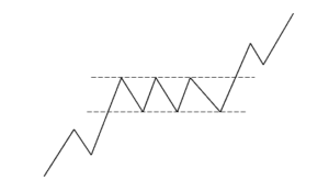
Rectangle. One of the simplest figures, it signals a continuation of the bullish or bearish trend. In its bullish variant, it manifests itself with a bullish movement, followed by a retracement, followed by a small minimum, followed by a retracement, followed by a small identical to the previous one, followed by another retracement and so on, until the bullish trend resumes. The longer the rectangle, the greater the reliability.
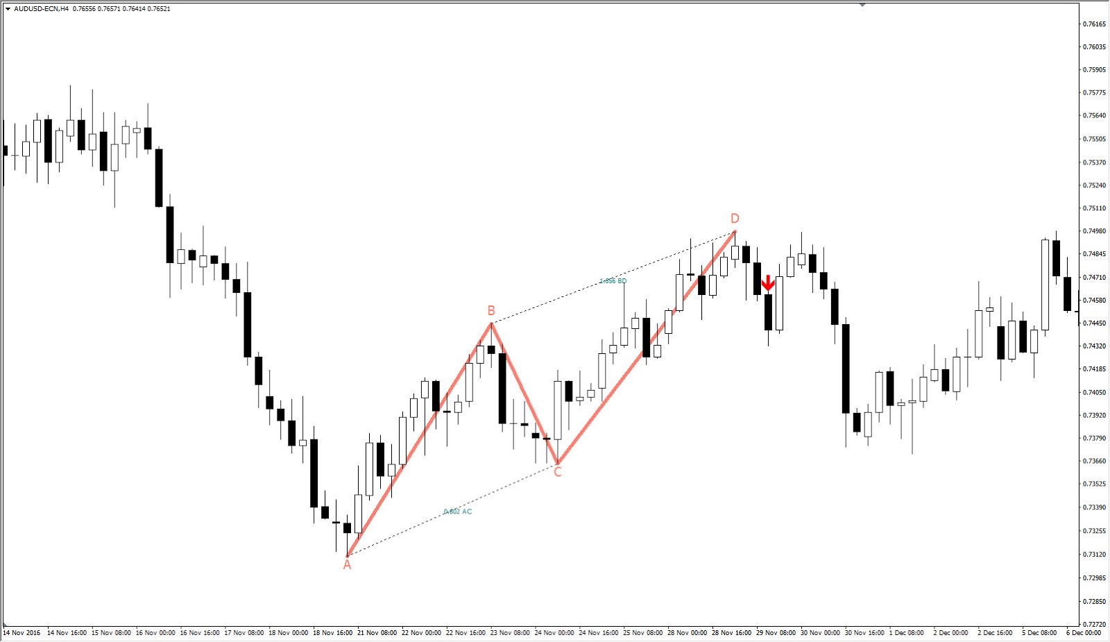
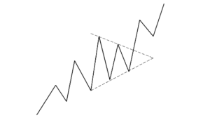
 Triangle
. A figure similar to the rectangle, also a continuation figure. In this case, however, the peaks are always lower than the previous one and the retracements are always less deep than the previous one. It is a slightly less reliable pattern than the rectangle, also because, in this case, it is rare that significant support levels are touched.
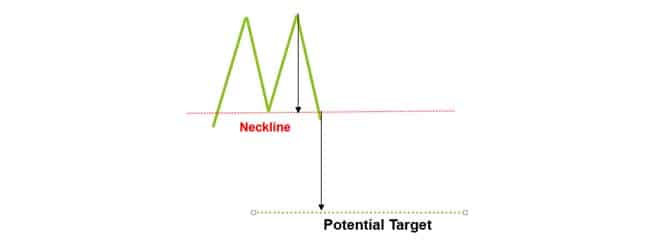
Double Top. A reversal pattern, it appears as an initial bullish movement, followed by a high, followed by a heavy decline (defined as the neckline), followed by a new high, followed by a bearish movement that goes beyond the neckline. The double top is very simple to identify and equally simple to read. It is one of the most reliable patterns, also because, in between, there is almost always a support (which corresponds to the neckline).
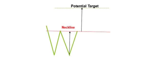
Double Bottom. This pattern is truly similar to the previous one. The shape is the same, but inverted. The signal is also in this case the reversal of the trend. In fact, it is equal and opposite to the double top. Specifically, it is formed by a bearish movement, followed by a low, followed by a decisive rise (defined as the neckline), followed by a new low, followed by a bullish movement. The basic idea is the same: if an adverse pivot point is broken through the trend, a reversal is likely.
 Head and Shoulders.
 A very complex and at the same time widespread figure. It is also reliable, but only if it appears in its entirety, drawing the ideal type of pattern. Specifically, it presents itself with a bullish movement, followed by a small high, followed by a bearish movement, followed by a much higher high, followed by a heavier decline than the previous one, followed by a high equal to the previous one, followed by a bearish movement. It is, as easily intuitable, a reversal figure. There is also an inverted Head and Shoulders, always signaling a trend reversal (but from bullish to bearish).
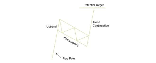
Flag. A continuation figure, it is formed by a bearish movement, followed by a small retracement, followed by a bullish movement that goes well beyond the previous one. The figure resembles, precisely, a flag. It is a reliable pattern, especially if the retracement travels a support (and bounces off it).
 V Formation
. As the name suggests, this figure appears as a bearish movement followed by a bullish movement. It is a reversal figure, although it can appear during a lateral phase. It is one of the most controversial patterns, as it is the subject of various controversies. According to some, it is not reliable and is not strictly speaking considered as if it were a pattern. However, if it is accompanied by a strong growth in volumes this (non) figure becomes truly reliable. It should still be taken into consideration as it occurs often.
Tips for Good Graphical Analysis
Put this way, graphical analysis seems like a piece of cake. After all, a glance is enough to identify the figures (if there are any) and draw the evidence necessary for a trade worthy of the name. However, things are more complicated than that. Graphical analysis is also fallible and graphical analysis is also capable of launching false signals. Here are some tips to avert this danger.
Look... Carefully. Basically, as already specified, it all seems very simple. And yet the human eye is easily fooled. Often, when you want to see something, that something appears. Or rather, it is interpreted in a prejudicial way. The risk, in technical analysis, is confusing one figure with another, or seeing a figure where there is a non-significant formation. The advice, therefore, is to look carefully, without prejudice, without expecting anything.
Don't overdo it. Some figures are objectively simple (like the double top or the double bottom), others are much more complicated (like the head and shoulders). Obviously, when a figure appears, it is not possible to ignore it. However, avoid opening a position on the basis of a complex figure, at least initially. Graphical analysis, like technical and fundamental analysis, for that matter, needs time to be mastered to the fullest. Just as it is best not to start with complicated indicators to do technical analysis, it is best not to start with complicated patterns to do graphical analysis.
Don't give up on other analyses. Graphical analysis alone is not enough. In fact, the risk is to often run into false signals. It must be accompanied by other analyses, as a confirmation. Or, to put it better, mutual confirmation. This, in truth, is advice that can work well for analysis in general. If you have a signal in your hands, don't stop, but verify it, even with other indicators or using multiple disciplines.