

ForexSentiment.live publishes two kinds of free page: analysis that reads 28 currency pairs plus gold for you, and calculators that do arithmetic on numbers you supply, across 65 instruments. This guide describes what each tool shows, where its numbers come from, and how often they change. None of it is a tick feed: sentiment, signals and the technical pages refresh several times a day on market days, roughly every three hours, and the daily plans are written once per trading night. Price labels say "analysis price" for exactly that reason.
1. Retail Sentiment: Where the Crowd Is Positioned
The home page grid shows, for each of the 29 markets, the share of retail traders holding long positions against the share holding short positions. The two figures add up to 100, green for long and red for short, drawn as a single split bar.
A book sitting between roughly 45 and 55 percent carries little information. Readings of 60/40 and beyond show a genuine imbalance, and 75/25 and beyond is a heavily one-sided book. The platform treats extreme positioning as a contrarian input rather than as confirmation, because retail exposure tends to build up against the prevailing move. The per-market detail pages add a history chart of the same reading, switchable between 7, 21 and 30 days.
The published figure is a blend of more than one positioning source, and it is stated as positioning rather than as a headcount of individual accounts.
2. Multi-Factor Signals: One Direction Per Pair
The multi-factor signals page combines five weighted readings of the same market into a single direction: bullish, bearish or neutral. Those five are retail positioning read contrarian, relative currency strength, chart patterns weighted down as they age, support and resistance levels taken from the platform's AI market analysis, and the high probability zones built on those levels.
Volatility and correlation are read alongside them but carry no weight in the score; they are context. A signal card shows the direction, a strength percentage describing how decided the combined reading is, a low, medium or high confidence rating for how much the factors agree, the analysis price the reading was built on, and a plain-language list of what supports the direction and what contradicts it. A factor with nothing to read steps aside instead of dragging the result toward the middle.
One caveat belongs in any honest description: the five inputs all read the same market and are correlated with each other, so a signal is one combined opinion rather than five independent confirmations. The page publishes a direction and a strength, not an entry, a stop and a target. Those belong to the next tool.
3. Daily Forecast: One Plan Per Session, Checked Afterward
Once every trading night the daily forecast reads all 29 markets for the session about to open and writes a concrete plan only where it finds a setup. Markets without one are published as neutral on purpose, so a typical board holds far fewer plans than markets, with a cap of three net plans per currency to stop the board becoming one idea repeated in twenty names.
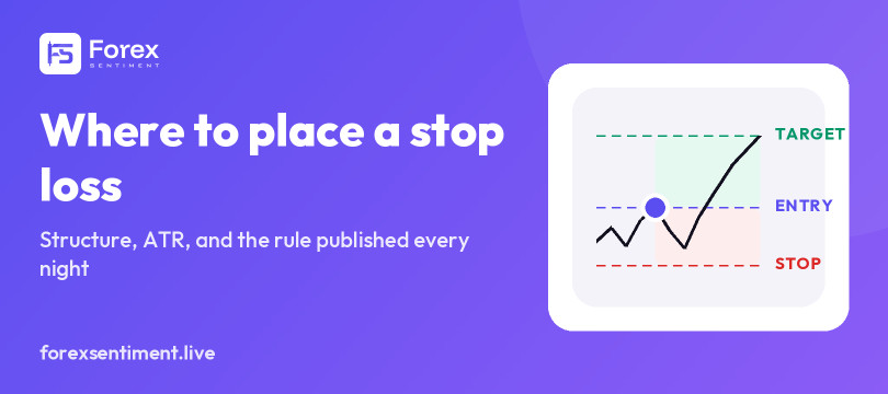
Each plan carries a direction, a confidence rating, an entry price with the order type that belongs to it, a stop, targets and a reward-to-risk ratio. Every entry is a limit order, which means the price sits back from where the market stood when the plan was written and stays the same trade for anyone who places it later in the session. Before publication the platform revalidates the geometry: levels on the correct side, risk inside sensible bounds, reward-to-risk recomputed on the server. Nothing is published below 1:1.
The verified record is the unusual part of the page. Every plan whose session has closed is judged against real candles, and the outcome is published whatever it says, with target-hit, stop-hit and timed-out counts kept separate and losing stretches left in.
4. Support and Resistance: The Levels Nearest to Price
The support and resistance page lists up to three levels on each side of the market, nearest first, with the percentage distance from the analysis price and a read on the current market regime. R1 and S1 are the levels closest to price, not the strongest ones, and the distances grow as the numbering rises.
The levels come from the platform's AI market analysis rather than from a hand-drawn trendline, and they are the same levels the signal engine and the zone builder work from. Because they are recomputed with each analysis cycle, a level can move or disappear between visits.
5. High Probability Zones: A Count of Converging Factors
The high probability zones page scores the analysis levels sitting nearest to price by how much confluence each one actually carries. A zone starts at 50 percent and earns points for each independent factor that lands on it: a Fibonacci retracement of the 30-day range, a chart pattern formed within a quarter of the pair's daily ATR of the level, a psychological round number, and the number of distinct times price has tested the level over 30 sessions.
The score is a count, not odds. As a rough scale, 51 to 55 percent means one factor is present, 56 to 65 percent means two, and 66 percent and above means three or four, with about 80 percent as the practical maximum. It is not a probability and not a backtest: it measures how many things converge on a level, not how often trading that level has worked. Which side a zone sits on is decided by the current price, so a level that once acted as support is treated as resistance once price has fallen through it. The volatility regime appears next to a zone as context and is not scored.
6. Chart Patterns: Eleven Candlestick Formations
The chart patterns page lists candlestick formations detected on H1, H4 and D1, each with the published historical reliability of that formation type and the time it was detected. Eleven formations are covered: bullish and bearish engulfing, hammer, shooting star, doji, morning star, evening star, three white soldiers, three black crows, double top and double bottom.
Figures that need a drawn trendline, such as head and shoulders, triangles, wedges and flags, are not detected, and the page lists nothing rather than something the detector does not compute. Only closed bars are read, never a candle still forming, and a pattern loses half of its weight in the signal every three bars of its own timeframe, so a daily engulfing from last week counts for very little today.
7. Volatility: The Expected Range of One Bar
The volatility page publishes a real Average True Range for each market on H1, H4 and D1, presented as the expected range over one bar of the chosen timeframe, in pips and in points for gold. Next to it sits the percentile, showing where current volatility stands against its own recent history, and the regime label: low below the 25th percentile, then normal, high, and extreme above the 90th.
The comparison window differs by timeframe. Daily and H4 measure the latest reading against the last 30 readings of the same timeframe. H1 measures the current hour against the same hour of the day over the previous three weeks, so the ordinary intraday cycle does not read as a change of regime. The practical use is position sizing and stop distance, both of which depend on how far the market normally travels.
8. Currency Strength: The Heatmap and the Dashboard
The currency strength heatmap ranks the eight major currencies by relative strength and momentum across five windows. The labels M15, H1, H4, D1 and W1 are horizons rather than candle sizes: they read roughly the last four hours, one day, two days, one market week and four weeks. The scale is absolute, so +1 means a full typical move for that window against the rest of the board and a quiet market reads near zero for everyone. Because the scale is not stretched to whichever currency moved most that day, the suggested pairings can legitimately come out empty, which is information rather than a fault.
The currency strength dashboard puts that ranking next to a correlation view between the currencies themselves, the strong-against-weak pairings that follow from it, and a market condition label with the ingredients behind it printed underneath. Gold is left out of the strength model because it is not one of the eight currencies being compared, and the pair pages say so instead of showing a blank.
9. Correlation Matrix: Avoiding the Same Risk Twice
The correlation matrix is computed on the daily returns of the last 30 sessions across the 29 markets, with coefficients running from -1 to +1. A reading near +1 means two markets have been moving together, a reading near -1 means they have been moving in opposite directions, and a reading near zero means recent moves have had little to do with each other.
The practical use is narrow and worth stating plainly: the matrix shows when two open positions are the same bet wearing two different names. It describes the last 30 sessions and carries no claim about the next one, since correlations shift as the drivers behind them shift.
10. Economic Calendar: The Week's Scheduled Releases
The economic calendar lists the scheduled macro releases of the current week for the eight major currencies plus the Chinese yuan, along with global events such as central bank symposiums. Each row carries an impact rating, the consensus forecast and the previous reading, with times shown in UTC and in the reader's own time zone. Released figures are added shortly after publication when the results feed is available, colored by whether the data feed rates the release as good or bad for that currency, which is the feed's own judgment against the revised previous reading and not a comparison with the consensus shown beside it.
One display rule is worth knowing. A numeric release that has already passed without a figure reaching the results feed is dropped from the list after a two-hour grace period rather than shown blank, while speeches, hearings, holidays and future rows are always kept. The page states how many releases it left out. This is the same calendar the daily forecast weighs as gap risk before publishing each session's plans.
The ten pages above read the market and publish what they find. The four below do the opposite: they take numbers you supply and hand back the arithmetic, with nothing predicted and nothing assumed. They also reach further than the analysis does, covering 65 instruments rather than 29: 58 currency pairs, gold and silver, and five crypto markets.
11. Lot Size: The Position That Keeps Risk Where You Set It
The lot size calculator turns a risk budget into the number MetaTrader asks for. Give it the account currency, the balance, the risk as a percentage or an amount, the market, and the stop distance either in pips or as an entry and a stop price. It returns the size in standard, mini and micro lots, the money actually at risk, the value of one pip in the account currency, and the price a profit target sits at for one, two and three times that risk.
Two details decide whether the answer is usable. The lot is rounded down to the nearest hundredth, so the risk taken is never larger than the risk typed. And gold is measured in points of 1.00 on a hundred-ounce lot rather than in pips, which is why a fifty-point stop and fifty pips are not the same instruction.
12. Pip Value: What One Pip Is Worth in Your Own Currency
The pip value calculator answers the question underneath the one above. Pick the market, the account currency and the position size, in lots or in units, and it returns the value of a single pip in the quote currency and in yours, with every step of the arithmetic printed underneath so it can be checked rather than trusted. A table lists all 65 instruments at one standard lot.
The specifications come from what brokers publish rather than from a rule applied to the pair's name, which matters more than it sounds: on the Hungarian forint a pip is 0.01 and not 0.0001, and a calculator that guesses from the name is wrong by a factor of a hundred.
13. Pivot Points: Five Families From One Candle
The pivot point calculator computes the classic, Fibonacci, Woodie, Camarilla and DeMark levels from a high, a low and a close. Most calculators of this kind ask you to type those three numbers off your chart. Here the previous session is already filled in for each of the 29 analyzed markets, any of the figures can be overwritten, and the current market price is shown against the levels so you can see which band price is sitting in.
Where sources disagree, the page says which convention it follows instead of picking one quietly. Woodie is built on the previous close rather than the current open. Camarilla defines no pivot of its own, so that row is left empty rather than borrowing the classic one. The third level is the one that varies most between platforms.
14. Market Hours: When Each Session Runs, and When It Moves
The market hours page shows the four main sessions in the reader's own time zone, with daylight saving applied from the real zones rather than from a fixed table, and the overlaps marked. What separates it from a clock is the second half: an hour-by-hour profile of how far each market has actually traveled, taken as the median range of each hour on real candles over the last three weeks of weekdays, in that market's own unit.
The difference is larger than most session maps suggest. On EUR/USD the quietest hour of the day is worth a few pips and the busiest several times that, and the page names both rather than describing a session as busy in the abstract.
Everything About One Market on a Single Page
When the question is about one specific market rather than the whole board, the pair analysis page gathers what the platform holds on it: the signal with its factor breakdown, the current forecast plan if one exists, sentiment with its history, support and resistance, detected patterns, high probability zones, volatility and correlations, plus currency strength for the two currencies involved. Swapping the symbol in the address opens any of the other markets.
The page also separates two things that are easy to confuse. The signal is the deterministic five-factor score and is always present. The forecast plan is written by a model for one session, carries entry, stop and target, and on many markets simply does not exist because the model saw no setup.
What These Tools Do Not Do
None of these pages is a trading recommendation, and none of them is a live quote. The numbers behind them are recomputed on a schedule, so an entry copied by hand hours later is not the trade that was published. Reliability figures attached to chart patterns are published statistics for that formation type, not a measurement of how the formation has performed on this site. Zone scores count converging factors and say nothing about odds. Only the daily forecast record is a measured outcome, and it is published in both directions.
The mobile apps carry the same readings, calendar display rules included. Used together, the tools describe a market from several angles; deciding what to do with that description remains the reader's job, along with position sizing and a stop that is set before the trade is opened.